I was reminded of my huge crush on wainscoting a few days ago, when a friend sent me a link of a house she had viewed. Foyer envy? I have it.
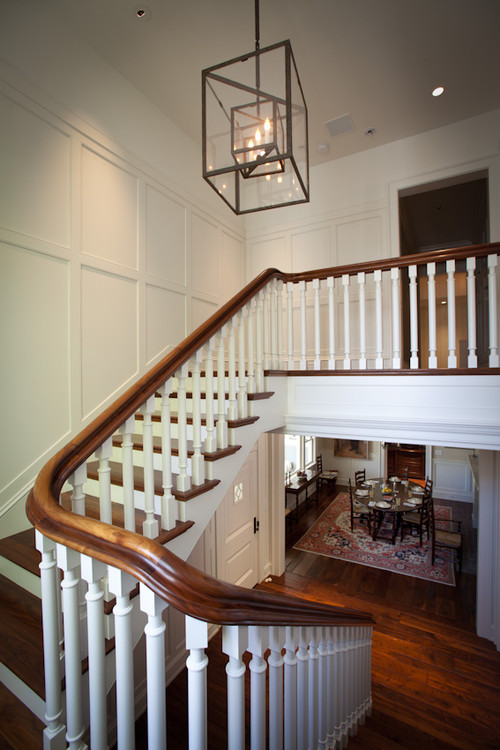
You see, I didn't see the oppressive oak paneling, nor did I acknowledge the dated brass chandelier or dark red carpet, because all I could see was this:
Bright and inviting, traditional, yet current - the above image proves that wainscoting doesn't have to be old fashioned or fuddy duddy.
There's something about the crisp detailing that adds impact to a space, and creates a finished aesthetic - in addition to drawing the eye up.
Originally used as insulation and a way of protecting walls from damp, the architectural element has existed for centuries. Wainscoting is mostly decorative now, and is a great way to add dimension to any space.
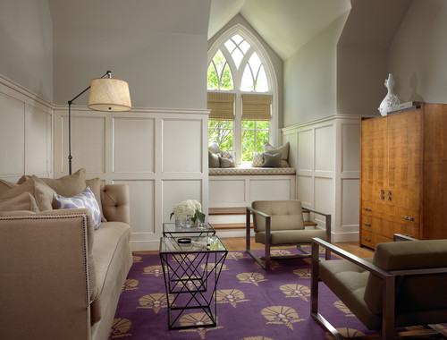
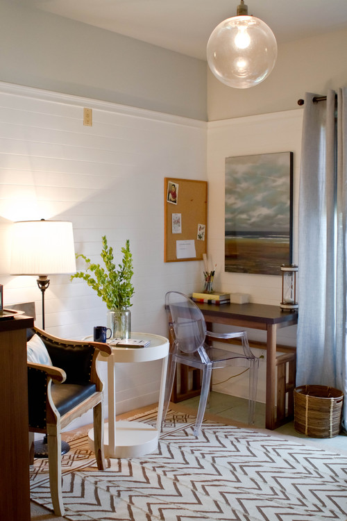
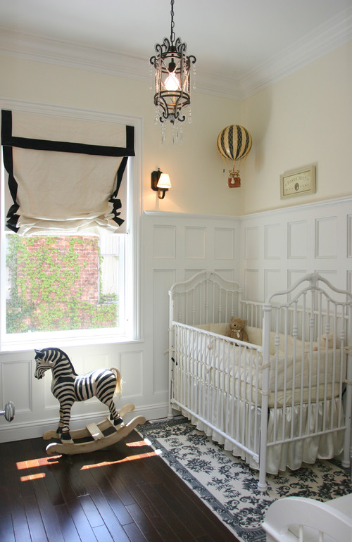
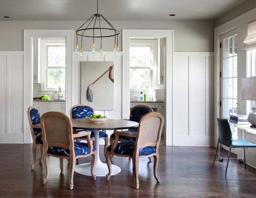
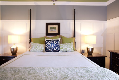
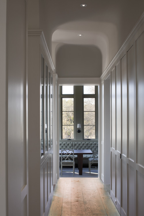
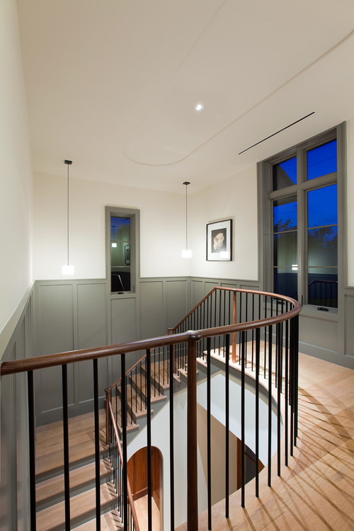
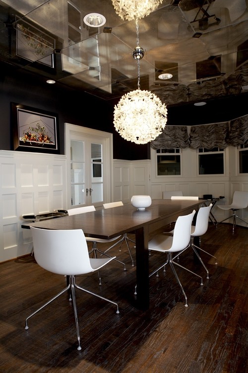
Here are more of my favourite examples:
 |
| via Homestork |
 |
| via Homestork |
Add a dose of strong colour - either on or above the wainscot, and a more modern look is achieved.
 |
| via Apartment Therapy |
Surprisingly, wainscoting is relatively simple and inexpensive to add to walls. So if you're inspired and would like to add a bit of architectural interest to one of your rooms, this tutorial is a great place to start.

No comments:
Post a Comment